Tuesday, December 29, 2009

Christmas Card Designs

This year I received many wonderful Christmas cards from friends and family, but also a few from companies vying for my business. Sending out a card to potential customers during the holidays can be difficult, especially for a big companies who don't want to offend anyone, doesn't it seem like we get more and more PC with each passing year? But, if they are well-designed and sincere, they can play a vital role in collecting more business during the holiday season.

Here are two examples of holiday cards I recently received in the mail. Both are from companies that I am currently using, but one struck me as containing much more holiday cheer and elevated design skills than the other.


Card #1: AT&T winter special offer holiday card

The blue envelope is addressed in a font that looks like real handwriting with an actual stamp. The front of the card is colorful and includes a funny winter story (there is no mention of any particular holiday, so it can be used for anyone). The colorful snowflakes add to its whimsical nature. The back features the Hallmark logo, which makes it seem like they went to the store and picked it out themselves.

Card #2: NetFlix holiday card

Although I like the color choices (red, light blue and white as opposed to the traditional red and green), this card is boring. The sans-serif "Happy Holidays!" seems typical and not at all heartfelt. The ornaments at the top look like there was no thought whatsoever put into them. It was sent in a plain white envelope with "To our neighbor at..." printed in the center. I almost threw it away without even opening it.

Card #1 (inside)

The inside of the at&t card features a cute message in the same scripty font as on the envelope. You also receive a coupon for $200 off of a service package. This coupon matches the design theme of the card (repeating the colorful stripe and snowflakes), but also introduces at&t's signature orange color (which contrasts beautifully with the blue envelope). Overall, I think that this holiday card was well designed and perfectly thought out.

Card #2 (inside)

I am all for using strategically placed white space...but this card uses way too much of it. It is so boring I think I am going to fall asleep just looking at it. I do like the repeated ornament, but maybe they should've included instructions on how to "enjoy the gift of Netflix". I currently have a Netflix account (which I love by the way), but if I didn't, this holiday card would not do anything to make me research their company. It just looks cheap and tacky. :(


Friday, December 25, 2009

MERRY CHRISTMAS!

Well, I got my wish...we had a white Christmas in Fort Worth Texas! I wasn't very optimistic when only a few days ago the thermometer hit 70 degrees, but Friday brought a snow storm, and we woke up to a sparkly white blanket of snow. Yay!! Being from Michigan, it doesn't really feel like Christmas without snow, so I'm happy that we got some!

Geordi didn't know what to think...so he just ate as much snow as he could :)

We didn't get a lot of snow, but at least we got some!

Merry Christmas and a Happy New Year to all of you! May you all have a safe and fun Holiday Season. -Holly

Tuesday, December 22, 2009

Twitter Background Update

My New Twitter Page!

I finally changed my Twitter background from the simple cloud design to one that I created in Photoshop. Being a Graphic Designer, I couldn't just use the template backgrounds...that's too easy! What would that say about my creativity? Nothing, that's what it would say. ;)

I saw this tutorial on abduzeedo.com on how to create digital bokeh in Photoshop, and I adjusted it a little to make my background unique (I used Hs instead of circles). I think that it turned out really cool, and now I can say that I have a designer Twitter page!

I had to finagle the image a bit to make it fit most screen resolutions, and these are the dimentions that I came up with (with a little help from various Google searches):

Total image size: 1728px by 864px (100px per inch, optimized for web view)
Left content: starts at about 15px from the left, ends at about 260px from the left

Check it out and let me know what you think!

Monday, November 9, 2009

Return From Obscurity


I know, I know...my last post was about 5 months ago, but I have been SO busy lately (I promise to keep up in the future). So many things in my life have changed I don't even know where to start!!

Exhibit A: A New Addition to the Family

Geordi, our Corgi puppy
(Yes, he is named after Geordi La Forge, can you tell my husband is a Star Trek fan?)

My husband and I recently adopted a Corgi puppy from a Connecticut breeder. To say that he is a handful is the understatement of the century! Before we got him, I re
searched all that I could about Corgis. I learned that they are working dogs, so they always need a "job" to do, or they'll misbehave. This is so true! I can't leave him alone for a second or he'll pull a sock out of the laundry basket or chase the cats. He is a force to be reckoned with! He makes it difficult to do anything productive around the house (like, I don't know, updating a blog?), but I'm glad we adopted him, he is the best dog ever.

Exhibit B: A New Place to Call Home, Yee Haw!


One week ago today, my husband Ben and I packed up our Honda Civic (yes, you read that right, we travel light) with our puppy Geordi, our two cats and all of our everyday things to move from Middletown, Connecticut to Fort Worth, Texas. What prompted the approx. 1,700 mile move? Ben's job needed people in Ft. Worth, and he was chosen to meet that need. At first I was nervous, but I am quickly becoming accustomed to my new home.

My First Week in Texas:
  • Learned the Texas Two-Step and strutted my stuff at a local bar
  • Attended a Rodeo at the Ft. Worth Stockyards
  • Ate real Texas BBQ at The Railhead (I had beef for two out of the three meals on Saturday, this is not the place for vegetarians!)
Exhibit C: A Happy Event

My sister got engaged!

My sister got engaged about a year ago, and the wedding is December 12th! I can't believe it's only a month away! I was chosen to be the Matron of Honor, and I don't take this job lightly. I have been helping her with all of the details especially the invitations, place cards and programs. I finished the invitations mid-October, and everyone absolutely loved them. (I'll be sure to post some pics because I am very proud of the way they came out).

As you can see, my life has been very busy...but now I finally have some time to update my website, blog and twitter posts, look for my updates in the near future! ;D


Tuesday, June 16, 2009

Invitations Galore!

I know it has been a while since my last post...but I have been working like crazy doing multiple freelance projects. I have been working on websites, a logo, and (the subject of this post) invitations! I quickly found out that I really like designing announcements and invitations. Usually they accompany a happy event, and I love channeling that happiness and excitement into my designs.

Here are some examples of things that I have done recently:


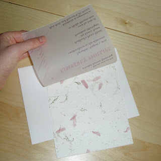
This is the invitation I designed for my sister's bridal shower. I wanted it to look classy, but not something you could buy from any store. I right aligned the text for a bit of a unique look, and chose the hand-made paper from hundreds of options a a local art store.

The text is printed on vellum, so the patterned paper shows through. No two invitations are exactly alike!

This is an announcement that I designed for a friend, isn't her kid adorable?
Photography by: Images by Michele


And finally, this is the invitation I designed for my sister's bachelorette party. I printed it on pearl paper, the subtle shine really makes it look great.

Wednesday, April 29, 2009

Green, Green, Everywhere!

It's no surprise that companies all over the globe are trying to make their products more green to attract more customers (oh yeah, and save the environment too). Recycling has become a lot more cool and attractive in the last few years.

Check out these recycling fashion statements:


Do you know how the recycling symbol came to be? Well, it is an interesting story! According to Wikipedia, "...the Container Corporation of America sponsored a contest for art and design students at high schools and colleges across the country to raise awareness of environmental issues. It was won by Gary Anderson, a 23-year-old college student at the University of Southern California whose entry was the image now known as the universal recycling symbol". Way to go Gary! I bet you never thought you would see your design on the front of so many products (or teenagers' T-shirts for that matter!).

Designers have also transformed the Möbius strip-like symbol into new and exciting designs, where will it go from here? There seems to be no end in sight, at least the planet is reaping the benefits of this trend!

Wednesday, April 15, 2009

A Take on Pepsi's New Logo

Hahaha! I saw this image on How Magazine's blog, and I had to post it up here. Lawrence Yang is the creative talent behind the drawing below. Lawrence, I agree with you, now that's all I see every time I see a Pepsi ad too!


P.S. Coke is better :)

Sunday, April 12, 2009

Happy Easter!

Easter is here, and it makes me think of an article that I read last year about a cool and unique way that Hatch design marketed themselves. They sent out Easter egg coloring kits, and allowed people to upload egg designs to their website. What an ingenious idea! Here are a couple of my favorite designs from this year's contest:

Pretty! :)

I can't look at this one too long...its an optical illusion!

Even the president is getting some face time

Monday, March 30, 2009

Math + Art + Simplicy = Cool

Hey, check out these unique pieces by Craig Damrauer. I love the simplicity of them! They are really creative, and they make sense mathematically! Who woulda thought? :)

Hit the nail right on the head with this one! Snacks make any meeting better.

See more at http://www.morenewmath.com/

Saturday, March 21, 2009

Photo Shoot 3/20/09

Yesterday Michele took pictures of me for my website's About Me page...and they came out great! I can't even tell you how happy I am with the results! They are creative, but I also look friendly and approachable, which is what I was trying to convey...Michele you are a genius! It is going to be difficult for me to choose which one(s) I want to feature on my website. Here are some of my favorite shots:

Nice composition, the pole and the railing frame me well.

Cool lighting effect. I look like I am at a pier, but I am really over a parking garage... that's the magic of photography!


My husband really likes this photo because 1. I am laughing and 2. You can see a nice shot of the city in the background. I especially like the way the red railing leads you into the photo.


Up up and away, I might fly right out of that alley


Michele put a dream-like effect on this photo, I love it!


Just hanging out at a cafe in Middletown


...and on some stairs, the angles are my favorite part of this photo


Last but not least, a close-up shot

I am so lucky that I have such a talented friend! She has a keen creative eye, and can find beauty and art in everyday settings. She is also a natural at making you feel comfortable in front of the camera. If you are interested in seeing more of Michele's work visit--> www.imagesbymichele.com.

Monday, March 9, 2009

Back to Basics


I was eating breakfast this morning, and I couldn't help but notice the bold new graphics on the Tropicana orange juice package. What happened to the good ol' straw sticking out of the orange? They have stripped the packaged down to the essentials: white background, glass of o.j., and 100% pure statement. Plain and to the point.

Orange juice is not the only beverage that has switched to minimalist packaging. Just look at the new Pepsi can: blue background, stripped down logo, the name, nothing else. Or the Vitamin Water bottle, with is two-toned label and simple text. Kraft has also come out with cleaner packaging. These companies know that simpler is better. Each of these designs practically jump out at you from the shelf.


I have to say, even though it is are so simple, I am visually pleased with this new trend. Maybe we will finally be able to say good bye to the over use of swirls and grunge accents. I hope so. :Z

Monday, March 2, 2009

My First Entry


After months and months of hard work I have finally published my website! New England is being hit by a huge snow storm right now, what better time to start my blog, right?

I thought I would start with a few pointers about publishing websites that I learned the hard way. I have worked extensively with Adobe Dreamweaver, but until now, have never actually published my work to the web. I thought it would be as easy as choosing a domain name/hosting site and uploading (voilà!), but unfortunately for me it was not that easy.
  1. The most important lesson I learned was when you first define your site in Dreamweaver (Site-->Manage Site) you must choose "Links Relative to" : "Site Root" not "Document". This will save you a lot of time (You wont have to replace all of the strings that Dreamweaver wrote for you when you browsed to your images).

  2. When using someone else's JavaScript, make sure to check their files to see if their urls match your images folder. For example, I used an upper case "I" to name my images folder, and the author of one of my JavaScripts used a lower case "i". For some reason everything worked when I tested it on my computer, but when I uploaded it, images were missing. It is still a mystery why it worked on my computer...but at least I learned a lesson.

  3. Last but not least, make sure to choose a reputable site as your web host. A friend recommended Yahoo! Small Business, and it worked out great.
I know you're thinking ok, ok, enough with the tech-talk, but I just had to get that out there so someone else could benefit. Thanks for visiting my blog, check back soon!