Tuesday, February 22, 2011

A Little Redundant...

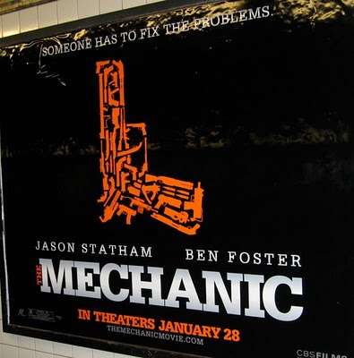
It's a gun!...made of other guns.

I saw a large ad for this movie the last time I went to the theater, and I must admit, it did catch my eye. It is very visually striking...but a little boring, c'mon a gun, made of other guns?? Couldn't they think of something more creative? I wonder how many guns are in the film?

Monday, February 14, 2011

Happy Valentine's Day!

(Illustration courtesy of iStockphoto)

Happy Valentines Day everyone! I hope you are all having a fun day! My husband and I celebrated on Sunday, a day early. He took me to see The King's Speech (great movie, by the way), out to dinner and to Cold Stone (yum!). I had a great early Vday. Love to you all!!!

Wednesday, February 9, 2011

That's Using Your Head!

This is a great example of an eye-catching advertisement. The minimal type with plenty of white space makes it easy to read (and the play on words is really cute). I also like how they overlaid the x-ray of the skull over the Spartan logo, genius!

I was recently back in Michigan and I saw a well designed billboard advertising the location of Michigan State University's new medical education and research center. This is the best use of a collegiate logo that I have seen in a long time...good job State! Read more about it here.

Monday, January 10, 2011

7 Billion

I just LOVE the typography in this video, and it is interesting too...could 7 billion people really fit into LA? It is a big city, but I didn't know it was that big. You learn something new every day!


Saturday, January 8, 2011

New Minimalist Logo


Starbucks is the next company to jump on the minimalist bandwagon. Beginning in March 2011 (coinciding with their 40th anniversary) you will see this new logo at your local Starbucks. They have stripped away almost everything, leaving only the smiling siren in their signature green color. Their new logo has been receiving a lot of praise (unlike Gap, who tried to redesign their logo in 2010, met harsh criticism, and ultimately retracted the change... more).

"The brand is now evolving to a point where coffee association is too confining and restrictive. Starbucks is fundamentally selling an experience, but by no means is coffee the only part of the experience. It is important that they not have a logo that is too confining."
- John Quelch, marketing professor, Harvard Business School
Starbucks has joined the big boys, they no longer need their company name or what they do included in their logo. I like the change, I think it looks updated without going over the top.

Here are some other companies that have done the same thing...some more successful than others...

Ok, I know you guys don't play music on your channel anymore...but did you have to go and chop off the bottom of the logo? Maybe they just put a white rectangle over the words, I guess they didn't care that they cut into the rest of the logo.

The ultimate example of brand identity using no words...just a swoosh.

This one is not so bad either...you don't need to include the word apple, it's obvious.

In my opinion, the before logo is WAY better. The after logo doesn't really read "organic farming"...more like "green space ship, powered by plant material".

Sunday, December 26, 2010

Merry Christmas!

Candy Cane Lane, Lancaster, California
They don't have snow out here in the desert...but they know how to make up for it by making their houses extra festive! The whole street looked like this!

I hope everyone had a very merry Christmas and a happy holiday season! I had a wonderful day yesterday here in Palmdale, CA with my family. We saw the famous Candy Cane Lane in Lancaster, decorated cookies, went to church then out to dinner, exchanged presents (I got Adobe CS5, woo hoo!), and took the dogs to the park (it was 60 degrees and sunny, very different from the Michigan blizzards that I'm used to).

I saved some images of some Christmas Tree themed emails that I got that I thought were cool:

This email from Anthopologie was super cute, each underlined gift idea directed you to that product on their website. I also like how it helps you decide what to get for the people on your list.

This image from an email from Apple caught my eye immediately. It is very creative and visually stimulating...I'll take one of each of the products featured on that tree! :)

Sugar Overload!!! Here is one of the cookies that I decorated this year, yum!

Monday, December 6, 2010

Thanksgiving 2010

Thanksgiving was great this year! It was our first west coast Thanksgiving dinner, and I think it knocked the socks off of our east coast tradition. :) My friends from San Francisco came to visit, adding two more to the 10 people who came to dinner. We had a full house! Here are some pics:

You can't have Thanksgiving without the excess of tasty food!

We rented a table and chairs from a local rental place, this was the BEST decision because everyone could sit at the same table! (and it looked good too).

This plastic silverware looked so real, and it made clean up a snap.

I got some cool appetizer plates and napkins from Target, I loved the design so much I might use the leftovers again next year!