Showing posts with label posters. Show all posts

Tuesday, March 1, 2011

So Cool!!!

If Cirque du Soleil did a show on typography, this is what the makeup would look like.

I would like to start March off right, with an awesome idea: melding photography, typography and painting. The Spanish studio, atipo, is responsible for these posters, see more here. The website is a little difficult to navigate (my slow internet connection is probably not helping), but the content is really interesting.

Check out this well-made video showing the artist's process, I wonder how long it took??

Tuesday, February 22, 2011

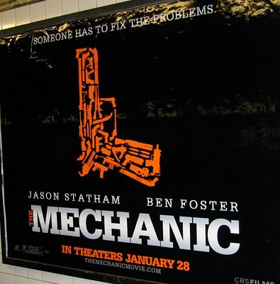
A Little Redundant...

It's a gun!...made of other guns.

I saw a large ad for this movie the last time I went to the theater, and I must admit, it did catch my eye. It is very visually striking...but a little boring, c'mon a gun, made of other guns?? Couldn't they think of something more creative? I wonder how many guns are in the film?

Wednesday, October 27, 2010

Cool Halloween Poster

I saw this poser in downtown LA while I was shopping. I made my husband take a picture of it with his iPhone because I wanted to share it with you guys! I think the way they connect Halloween costumes and their logo is ingenious! Goodwill did a good job!

This poster definitely made me look twice, it is so cute! It is a perfect example of a large company being playful with their logo (Google also does this). It would've been fun to work on this project and decide which "costumes" the Goodwill guy would dress up in. The werewolf is my favorite! :)

Monday, February 15, 2010

Olympic Posters


The Olympics are under way! So far I've caught a quick snippet of the opening ceremony and watched the men's speed skating while eating at a local sushi restaurant. I'm looking forward to super-G downhill skiing and ice hockey, go USA!

A lot of effort goes into promoting the Olympics, and posters are a great way to convey important information in a short amount of time. Here are some of my favorite posters of past Olympic games:


St. Moritz, 1948
I love the illustration on this poster, it makes me think of the perfect ski day.


Grenoble, 1968
The typography is very cool on this poster. I like how the text is right-aligned and the moving Olympic rings are speeding towards the right corner of the poster.


Sarajevo, 1984
This poster uses a striking symbol as well as the always eye-catching orange-blue color scheme. On the other hand, I wonder how the designer got away with changing the classic Olympic rings from multicolored to just orange...it changes the meaning a little bit, and makes it look less like an Olympic advertisement.


Torino, 2006
This poster expertly uses the colors featured in the Olympic rings to create a design that stands out, um, I'm just not sure what it is...Is it supposed to depict a specific sport or is it just abstract?


Vancouver, 2010
Here is this year's poster. I like the echo of the Canadian Maple leaf, but I don't think this poster is as memorable as some of the others.

To see all of the winter Olympic posters from 1924-present click here.