
Monday, March 14, 2011
Think About This...
This video is really well done, and raises many questions about life in the digital age. It is a little old (2007), but I think the message still applies today. Take a look, and leave a comment telling me what you think!

Tuesday, March 1, 2011
So Cool!!!

If Cirque du Soleil did a show on typography, this is what the makeup would look like.
I would like to start March off right, with an awesome idea: melding photography, typography and painting. The Spanish studio, atipo, is responsible for these posters, see more here. The website is a little difficult to navigate (my slow internet connection is probably not helping), but the content is really interesting.
Check out this well-made video showing the artist's process, I wonder how long it took??
Tuesday, February 22, 2011
A Little Redundant...
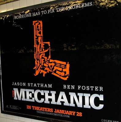
It's a gun!...made of other guns.
I saw a large ad for this movie the last time I went to the theater, and I must admit, it did catch my eye. It is very visually striking...but a little boring, c'mon a gun, made of other guns?? Couldn't they think of something more creative? I wonder how many guns are in the film?
Monday, February 14, 2011
Happy Valentine's Day!

(Illustration courtesy of iStockphoto)
Happy Valentines Day everyone! I hope you are all having a fun day! My husband and I celebrated on Sunday, a day early. He took me to see The King's Speech (great movie, by the way), out to dinner and to Cold Stone (yum!). I had a great early Vday. Love to you all!!!
Wednesday, February 9, 2011
That's Using Your Head!

This is a great example of an eye-catching advertisement. The minimal type with plenty of white space makes it easy to read (and the play on words is really cute). I also like how they overlaid the x-ray of the skull over the Spartan logo, genius!
Monday, January 10, 2011
7 Billion
I just LOVE the typography in this video, and it is interesting too...could 7 billion people really fit into LA? It is a big city, but I didn't know it was that big. You learn something new every day!
Saturday, January 8, 2011
New Minimalist Logo

Starbucks is the next company to jump on the minimalist bandwagon. Beginning in March 2011 (coinciding with their 40th anniversary) you will see this new logo at your local Starbucks. They have stripped away almost everything, leaving only the smiling siren in their signature green color. Their new logo has been receiving a lot of praise (unlike Gap, who tried to redesign their logo in 2010, met harsh criticism, and ultimately retracted the change... more).
"The brand is now evolving to a point where coffee association is too confining and restrictive. Starbucks is fundamentally selling an experience, but by no means is coffee the only part of the experience. It is important that they not have a logo that is too confining."
- John Quelch, marketing professor, Harvard Business School

Starbucks has joined the big boys, they no longer need their company name or what they do included in their logo. I like the change, I think it looks updated without going over the top.
Here are some other companies that have done the same thing...some more successful than others...

Ok, I know you guys don't play music on your channel anymore...but did you have to go and chop off the bottom of the logo? Maybe they just put a white rectangle over the words, I guess they didn't care that they cut into the rest of the logo.

The ultimate example of brand identity using no words...just a swoosh.

This one is not so bad either...you don't need to include the word apple, it's obvious.

In my opinion, the before logo is WAY better. The after logo doesn't really read "organic farming"...more like "green space ship, powered by plant material".
Subscribe to:
Posts (Atom)


